

In this blog post you will learn how to create a minimal Oracle Sites Cloud Service (SCS) component that has a simple HTML template and CSS. Component that you create will have a simple Settings Panel and an entry for the theme design.json file to allow you or other SCS user to pick from 3 built-in styles when using H1 Component in the Site Builder.
When you create new component in SCS, you get a set of seeded files that will work out-of-the-box. The seeded code covers most of functionality of a component within the product and the “Tutorial: Developing Components with Knockout” section on SCS documentation explains how all the pieces of the component fit together.
In this post I will explain how to change the seeded code to create your own component that will require only a small subset of seeded code.
Step 1: Create New Component
After this step you will have created your component with the Sites Cloud Service that you can immediately drop onto the page and run. This is the starting point for creating any new component.
To create a local component:
- Navigate to Sites -> Components
- Select option Create -> Create Local Component
- Enter a name, for example “H1_Component” and optionally, description
- Click “Create” to create new component

Checkpoint 1
Now that you have successfully created a component, you should see this component in the Components catalog as well as in the Add > Custom component palette for any site you create or edit. Use the following steps to validate your component creation:
- Create a new site using any seeded Template, for example create a site called “ComponentTest” using the “StarterTemplate” template.
- Select Edit option and create an update for the site to open it in the Site Builder
- Edit a page within the site that you created
- Click on the Add (“+”) button on the left bar and select “Custom” for the list of custom components
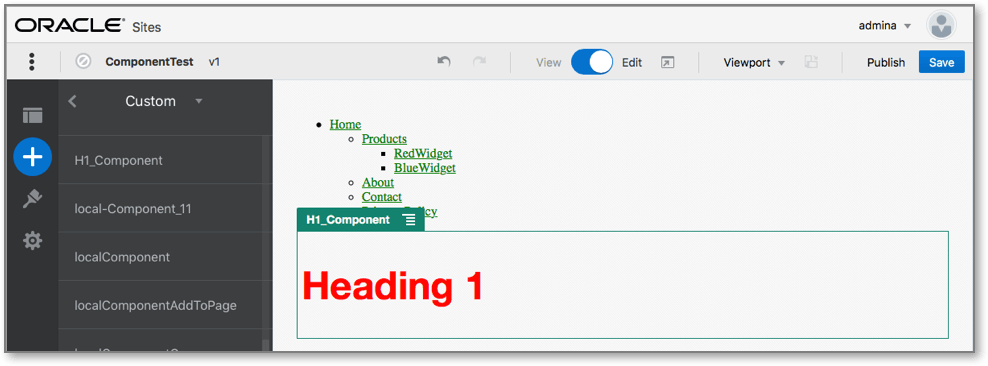
- Select the “H1_Component” from the custom component Palette and drop it onto the page.
You should now see a default rendering for the local component you created:
Using Settings Panel, you can change the way seeded component looks by:
- Select the context menu in the banner for the component you dropped.
- Select “Settings” from the drop-down menu. You can change setting to see how seeded component rendering will change.
In the following steps I will describe how you can modify seeded files to create a new custom component and how to modify it for your own purposes.
Step 2: Create the Basic H1 Component
In this step you will remove most of the content in seeded files to create new H1 Component. It will simply display the heading text that you seed when you create the viewModel. In subsequent steps you will learn how to provide settings and styles for the component.
To review the structure of your local component:
- Using the Document Cloud Service Desktop Sync Client, locate your component and sync it with the file system (select the Start Sync or Select Folders to Sync option in the latest version of Sync Client)
- If you don’t have the Desktop Sync Client, you can also select the component in the Components tab of the Sites Cloud Service and drill down to see the files
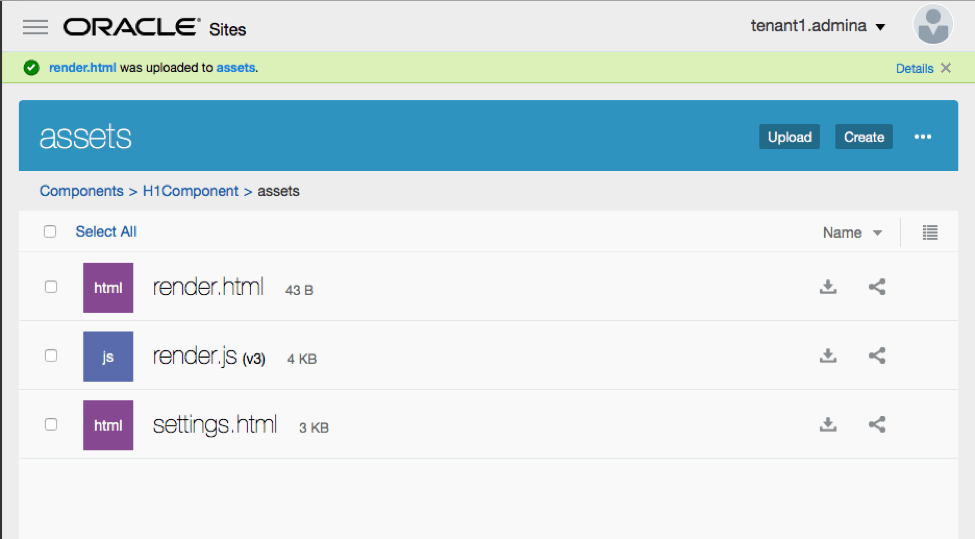
- If you list the files under the component, you will see:
- “assets” folder with the component files:
- render.js
- settings.html
- appinfo.json – JSON file with component description , and
- folder_icon.jpg – icon that is displayed in the Components catalog
- “assets” folder with the component files:
For details about appinfo.json file content see “About Developing Component” section in Oracle SCS documentation.
To create an H1 Component:
1. Open the appinfo.json file and replace its content with the following:
{
   "id": "h1-component-id",

   "settingsData": {
   "settingsHeight": 90,
   "settingsWidth": 300,
   "settingsRenderOption": "inline",
   "componentLayouts": [ ],
   "triggers": [ ],
   "actions": [ ]
   },

   "initialData": {
   "componentId": "h1-component-id",
   "customSettingsData": {
     "headingText": "Heading 1"
     },
   "nestedComponents": [ ]
   }
}
2. Open up the render.js file under “assets” directory in your favorite text editor
Change the contents to the following:
/* globals define */
define(['knockout', 'jquery', 'text!./render.html'], function(ko, $, template) {
'use strict';
// ----------------------------------------------
// Define a Knockout ViewModel for your template
// ----------------------------------------------
var SampleComponentViewModel = function(args) {
var SitesSDK = args.SitesSDK;

// create the observables -- this allows updated settings to automatically update the HTML on the page
this.headingText = ko.observable();

//
// Handle property changes from the Settings panel
//
this.updateCustomSettingsData = $.proxy(function(customData) {
this.headingText(customData && customData.headingText);
}, this);
this.updateSettings = function(settings) {
if (settings.property === 'customSettingsData') {
this.updateCustomSettingsData(settings.value);
}
};
// Register your updateSettings listener to recieve SETTINGS_UPDATED events
SitesSDK.subscribe(SitesSDK.MESSAGE_TYPES.SETTINGS_UPDATED, $.proxy(this.updateSettings, this));

//
// Get the initial settings data for the component and apply it
//
SitesSDK.getProperty('customSettingsData', this.updateCustomSettingsData);
};

// ----------------------------------------------
// Create a knockout based component implemention
// ----------------------------------------------
var SampleComponentImpl = function(args) {
// Initialze the custom component
this.init(args);
};
// initialize all the values within the component from the given argument values
SampleComponentImpl.prototype.init = function(args) {
this.createViewModel(args);
this.createTemplate(args);
this.setupCallbacks();
};
// create the viewModel from the initial values
SampleComponentImpl.prototype.createViewModel = function(args) {
// create the viewModel
this.viewModel = new SampleComponentViewModel(args);
};
// create the template based on the initial values
SampleComponentImpl.prototype.createTemplate = function(args) {
// create a unique ID for the div to add, this will be passed to the callback
this.contentId = args.id + '_content_' + args.viewMode;
// create a hidden custom component template that can be added to the DOM
this.template = '
<div id="' + this.contentId + '">' +
template +
'</div>

';
};
//
// SDK Callbacks
// setup the callbacks expected by the SDK API
//
SampleComponentImpl.prototype.setupCallbacks = function() {
//
// callback - render: add the component into the page
//
this.render = $.proxy(function(container) {
var $container = $(container);
// add the custom component template to the DOM
$container.append(this.template);
// apply the bindings
ko.applyBindings(this.viewModel, $('#' + this.contentId)[0]);
}, this);
//
// callback - dispose: cleanup after component when it is removed from the page
//
this.dispose = $.proxy(function() {
// nothing required for this sample since knockout disposal will automatically clean up the node
}, this);
};
// ----------------------------------------------
// Create the factory object for your component
// ----------------------------------------------
var sampleComponentFactory = {
createComponent: function(args, callback) {
// return a new instance of the component
return callback(new SampleComponentImpl(args));
}
};
return sampleComponentFactory;
});
In the assets folder, create a new file: render.html which will be the simple HTML template of the component.
Use the following contents in the render.html file:
<h1 data-bind="text: headingText()"></h1>
he component assets folder will now contain 3 files:
Checkpoint 2
Add the new H1 Component to your page.

Step 3: Adding CSS for Your Component
In this step you will add a CSS that will provide default style for your component.
1. Add the following design.css file to the assets folder of your component, with the following contents:
.h1-component-default-style .scs-component-content {
   font-family: "Helvetica Neue", "Helvetica", "Arial", sans-serif;
   font-size: 24px;
   color:red;
   font-weight: normal; }
2. Add to appinfo.json to declare the style class prefix which will be used to style your component. You can see that with a styleClassName of ‘h1-component’ is added. Thus when your component is dropped onto the page, the default style will be h1-component-default-style. New contents of appinfo.json will be:
{
 "id": "h1-component-id",

 "settingsData": {
 "settingsHeight": 90,
 "settingsWidth": 300,
 "settingsRenderOption": "inline",
 "componentLayouts": [ ],
 "triggers": [ ],
 "actions": [ ]
 },
 "initialData": {
 "componentId": "h1-component-id",
 "styleClassName":"h1-component",
 "customSettingsData": {
 "headingText": "Heading 1"
 },
 "nestedComponents": [ ]
 }
}
3. Finally, update render.js to load your CSS file:
Change line 2 in render.js from:
define(['knockout', 'jquery', 'text!./render.html'], function(ko, $, template) {
to:
define(['knockout', 'jquery', 'text!./render.html', 'css!./design.css'], function(ko, $, template, css) {
NOTE: since you have changed appinfo.json, you must refresh the browser, add your component again to a page to pick up the changes
Checkpoint 3
Your component will now pick up its default style, and look like this. Don’t forget you needed to refresh the browser and add your component again to the page since appinfo.json was changed.
Step 4: Adding Settings Panel to Allow the Heading Text to be Changed
In this step, you will update settings.html to provide a settings panel which can be used to set the text of the H1 Component.
Update the settings.html file to have the following contents:
<!DOCTYPE html>
<html lang="en">

<head>
<!-- only allow embedding of this iFrame in SCS -->
<meta http-equiv="Content-Type" content="text/html; charset=UTF-8">
<title>H1 Component</title>
<!-- include sample apps styling -->
	<link href="/_sitescloud/renderer/app/sdk/css/app-styles.css" rel="stylesheet">
<!-- include supporting files -->
<script type="text/javascript" src="/_sitescloud/renderer/app/apps/js/knockout.min.js"></script>
 <script type="text/javascript" src="/_sitescloud/renderer/app/apps/js/jquery.min.js"></script>
<!-- include the Sites SDK -->
<script type="text/javascript" src="/_sitescloud/renderer/app/sdk/js/sites.min.js"></script>
</head>

<body data-bind="visible: true" style="display:none; margin:0px; padding:0px;background:transparent;background-image:none;">

<div class="scs-component-settings">

<div>
 <!-- Heading Text -->
 <label id="headingTextLabel" for="headingText" class="settings-heading" data-bind="text: 'Heading Text'"></label>
 <input id="headingText" data-bind="value: headingText" placeholder="Heading" class="settings-text-box">
</div>

</div>

 <script type="text/javascript">
 // define the viewModel object
 var SettingsViewModel = function() {
 var self = this;

 // create the observables for passing data
 self.headingText = ko.observable();

 // create rest of viewModel
 self.saveData = false;

 // Get custom settings
 SitesSDK.getProperty('customSettingsData', function(data) {
 // update observable
 self.headingText(data.headingText);

 // now that viewModel is initialized and can start saving data
 self.saveData = true;
 });


 // save whenever any updates occur, but don't save if data hasn't been loaded into the form yet
 self.save = ko.computed(function() {
 var saveconfig = {
 'headingText': self.headingText()
 };

 // save data in page
 if (self.saveData) {
 SitesSDK.setProperty('customSettingsData', saveconfig);
 }
 }, self);
 };


 // apply the bindings
 ko.applyBindings(new SettingsViewModel());
 </script>
</body>
Checkpoint 4
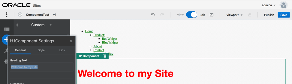
Select your component in the builder, and click ‘Settings’. The settings panel is small, and is set to be embedded at the top of the component settings panel… look for the section titled ‘Heading Text’.
When you change heading text in the settings panel, the component will update to show the new text.
Step 5: Updating the Theme to Allow Other Users to Pick Style for H1 Component
In the last step, you will register styles for your component with the theme, so that other users in SCS using your component in the Site Builder, can switch between the styles you provide for your component from the Settings panel / Style tab.
Add to your component design.css some more styles. They all need to be prefixed with the component’s registered ‘styleClassName’ as defined in appinfo.json. For this component, that prefix is ‘h1-component’. Here you can see that 2 more styles h1-component-gothic-style and h1-component-courier-style have been added.
The new contents of design.css will now be
.h1-component-default-style .scs-component-content {
   font-family: "Helvetica Neue", "Helvetica", "Arial", sans-serif;
   font-size: 24px;
   color:red;
   font-weight: normal; }
.h1-component-gothic-style .scs-component-content {
   font-family: "Century Gothic","CenturyGothic","AppleGothic",sans-serif;
   font-size: 32px;
   font-weight: bold; }
.h1-component-courier-style .scs-component-content {
   font-family: "Courier";
   font-size: 32px;
   font-weight: bold; }
Register your styles in the theme’s design.json file. You can find this file in the Theme the site is using. Drill into the theme files into the “designs” folder, then into the “defaults” folder, and add a section for your component to design.json. The highlighted text below is an example of what to add.
  "news-article": {
   "styles": [{
     "name": "News Article 1",
     "class": "news-article-default-style"
     },
   {
     "name": "News Article 2",
     "class": "news-article-style-1"
   }
   ]
   },
   "h1-component": {
     "styles": [{
       "name": "Plain",
       "class": "h1-component-default-style"
     }, {
       "name": "Courier",
       "class": "h1-component-courier-style"
     }, {
        "name": "Gothic",
        "class": "h1-component-gothic-style"
     }]
   }
  },
  "componentIcons": {
  "scs-socialbar": {
 " icons": [
Checkpoint 5
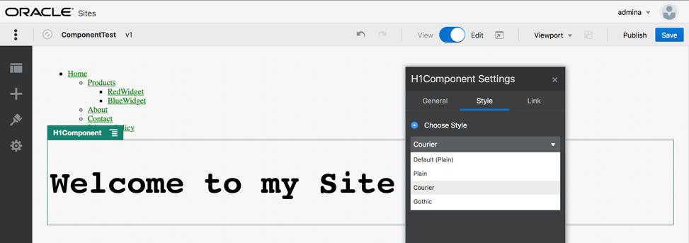
The names in the design.json snippet you added (“Plain”, “Courier”, “Gothic”) will appear in the settings panel for your component on the style tab as below. When selected, they will apply the corresponding styles (“h1-component-default-style”, “h1-component-courier-style”, “h1-component-gothic-style”) respectively, on your component.
 Igor's Musings About Technology