
In this blog post I will explain how you can style built-in components in Oracle Sites Cloud Service (SCS). Built-in SCS components get their visual styling from two places:
- comp.css, a built-in CSS file that specifies the “base” look of each component
- design.css, a CSS file that is part of the Theme that your site is using
In the design.css file, you can override and extend the built-in comp.css styles to create your own look and feel. In a Theme, the design.css file is in the designs/default directory.
I will start by describing classes in the comp.css file that are common to all built-in components, as well as a brief overview of defining a Theme.
Part 1: Component Styling Basics
All built-in SCS Components share a similar CSS class structure. Each component has the following three CSS classes applied to its outermost <div> element:
scs-component scs-type design-style
The type is the component type (e.g. image, gallery, divider, etc.) and design-style is the chosen style class for this component, as defined in the Theme’s design.json file.
Theme Styles Basics
A Theme’s design.json file lists all the styles (frame, shadow, highlighted, etc.) that can be applied to each type of component (e.g. button, image, etc.). Each style has both a display name and a class name. The display name is shown on the Style tab of the Settings panel. The class name refers to a CSS selector in the Theme’s design.css file. For example, below is the entry for Button component:
"scs-button": {
 "styles": [{
 "name": "COMP_STYLE_ALTA_SMALL",
 "class": "scs-button-default-style"
 },
 {
 "name": "COMP_STYLE_ALTA_LARGE",
 "class": "scs-button-style-2"
 },
 {
 "name": "COMP_STYLE_SIMPLE",
 "class": "scs-button-style-3"
 }
 ]
},
Names of built-in components are translated, thus what you see a key to get style name from the resource bundle. If you add Button component to a page and then choose the “Simple” style in the Settings > Style panel, design.json associates the display name “Simple” (key “COMP_STYLE_SIMPLE”) with the class name “scs-button-style-3”. The Button will be rendered with the following classes:
scs-component scs-button scs-button-style-3
If no style is chosen for a given component, then default style “scs-type-default-style” is used. In the above example, the Button will be rendered with the following classes:
scs-component scs-button scs-button-default-style
The “scs-component-content” Style
For every built-in component, inside the scs-component <div> mentioned above, there is a “content” <div> with CSS class “scs-component-content”. In other words:
. scs-component scs-type design-style
.    scs-component-content
In design.css file, the “scs-component-content” class is often used to style the “box” around the component (e.g. do apply border, shadow, etc.).
It’s worth noting that in the built-in comp.css file, the common “scs-component-content” class is defined with position:relative and display:inline-block, among other CSS properties.
While “scs-component-content” is useful for styling the “box” around each component, component-specific classes are needed to fully style a component. In Part 2 I will describe how to use the component-specific classes that appear inside “scs-component-content” to style each of the built-in components.
Part 2: Component-Specific Styling
Image Component
The Image component has the following CSS class structure below the “scs-component-content” class:
. scs-image-container
.    scs-image-link
.       scs-image-image
.       scs-image-caption
The “scs-image-image” class is applied to the <img> tag itself. The “scs-image-caption” class is used to style the caption, if caption present. The “scs-image-link” is present only if the image has a link attached. Neither it, nor “scs-image-container” class is typically requiring custom styling.
By default, the image caption is rendered as a semi-transparent overlay stretched across bottom of the image:

. .scs-image-style-17 .scs-image-caption {
.    position: absolute;
.    top: 0px;
.    height: 35px;
.    font-weight: bold;
.    background-color: rgba(122, 213, 256, 0.54);
.    color: #515151;
. }
To place it at the top of the image and change colors, add extra style for the Image component in design.json file and then define CSS for it in the design.css file:

. .scs-image-style-17 .scs-image-caption {
.    position: absolute;
.    top: 0px;
.    height: 35px;
.    font-weight: bold;
.    background-color: rgba(122, 213, 256, 0.54);
.    color: #515151;
. }
Button Component
The Button component has the following class structure:
. scs-button-button
.    scs-button-text
The “scs-button-button” class is the clickable <div>, styled to look like a button. The “scs-button-text” class is used to style the text inside the button. For example, test changing look and feel of the Button component by adding extra style for in design.json file and then define CSS for it in the design.css file:
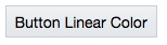
.design-style .scs-button-button {
 background-image: linear-gradient(
 to top, #E3E7E9 0%, #E7EBED 50%, #F1F3F3 100%);
 border: 1px solid #c4ced7;
 color: #000000;
}

.design-style .scs-button-button:hover {
background: #f7f8f9;
border: 1px solid #c4ced7;
 color: #0572ce;
}

.design-style .scs-button-button:active {
background: #0572ce;
border: 1px solid #0572ce;
color: #ffffff;
}

.scs-button-style-4 .scs-button-button {
 background-image: radial-gradient(
 red, yellow, green
 );
 border: 1px solid #c4ced7;
 color: #000000;
}

.scs-button-style-4 .scs-button-button:hover {
 background: #f7f8f9;
 border: 1px solid #c4ced7;
 color: #0572ce;
}

.scs-button-style-4 .scs-button-button:active {
 background: #0572ce;
 border: 1px solid #0572ce;
 color: #ffffff;
}
Document
The Document component has the following class structure:
. scs-document-container
.    scs-document-cap
.       scs-document-title
.       scs-document-desc
The “scs-document-container” class wraps the document viewer, and is not normally styled. The “scs-document-cap” styles the caption area, if present. Within the caption area are “scs-document-title” (caption title) and “scs-document-desc” (page number).
By default, Document component renders the caption as a semi-transparent overlay stretched across bottom of the document, using the CSS class below:
.design-style .scs-document-cap {
 position: absolute;
 left: 0px;
 bottom: 0px;
 right: 0px;
 background-color: rgba(0, 0, 0, 0.54);
 padding: 0.5em;
 color: #FFFFFF;
}
Gallery
The Gallery component has a single class wrapping the underlying JSSOR slider component:
scs-gallery-container
The JSSOR slider uses several classes that may be styled as well (for extra information about style classes available for styling JSSOR slider see here):
jssorb14 (navigator)
jssora02l (left arrow)
jssora02r (right arrow)
jssort07 (thumbnails)
Gallery Grid
The classes used for the Gallery Grid component depend on the layout and cropping selected in the Settings Panel:
. scs-gallerygrid-container scs-gallerygrid-layout
.    scs-gallerygrid-cell
.       scs-image (multiple)
Depending on the cropping and layout settings selected for Gallery Grid, the value of layout above will be either stretch, crop, fit, or flowing. The “scs-gallerygrid-cell” class is only present for Column layouts.
Social Bar
The Social Bar component has the following class structure:
. scs-socialbar-container
.    scs-socialbar-icon
The “scs-socialbar-icon” class is applied to each <img> tag in the social bar.
Paragraph
The Paragraph component has only a single class wrapping the actual paragraph text which makes it real easy to style the text in the Paragraph component:
scs-paragraph-tex
For example, to make text that you contribute in the Paragraph component to have this engraved-text-on-metal effect often used by Apply, add extra style class in design.json file and then define CSS for it in the design.css file:
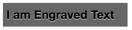
.scs-paragraph-style-7 {
 font-size: 24px;
 font-family: Arial, Helvetica, sans-serif;
 font-weight: 700;
 padding: .3em;
 color: #000000;
 background: #666666;
 text-shadow: 0px 1px 1px #ffffff;
}
Or if you want to get fancy, use something like that:
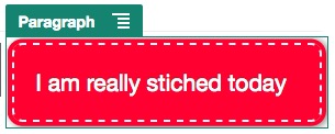
.scs-paragraph-style-8 {
 padding: 20px;
 margin: 10px;
 background: #ff0030;
 color: #fff;
 font-size: 21px;
 font-weight: bold;
 line-height: 1.3em;
 border: 2px dashed #fff;
 border-radius: 10px;
 box-shadow: 0 0 0 4px #ff0030, 2px 1px 6px 4px rgba(10, 10, 0, 0.5);
 text-shadow: -1px -1px #aa3030;
 font-weight: normal;
}
Title
The Title component also has only a single class wrapping the actual text thus you can style it as easy as text in the Paragraph component:
scs-title-text
Map
The Map component has a single class wrapping the map rendition:
scs-map-content
This class is not normally styled.
Custom Local Component
The Custom Local Component has only a single class wrapping the actual component:
scs-custom-component-wrapper
You have a full control of CSS styles that you need to use to render custom view for your custom local component. Local component is rendered inline, i.e. you can directly apply CSS styles defined in your Theme or in the design.css file.
Custom Remote Component
The Custom Remote Component has only a single class wrapping its iframe:
scs-app-iframe-wrapper
In addition to applying CSS style defined in your custom remote component, you can leverage Sites SDK to fetch design.css file from the host site (for reference):
// fetch current theme design from host site and then add it to the page
SitesSDK.getSiteProperty('theme',function(data){
 // check if we got an url back
 if ( data.url && typeof data.url === 'string' ) {
 if ( data.url !== '') {
 // theme is loaded so dynamically inject theme
 SitesSDK.Utils.addSiteThemeDesign(data.url);
 }
 }
});
Thus, you can make your component to inherit styling from the host style.
Divider
Although there are no component-specific classes for the Divider component, the <hr> tag itself may be styled. For example, you can create a dotted divider:
.design-style .scs-divider hr {
 border-top: 1px dotted #333333;
}
Video, YouTube, Spacer
There are no component-specific classes for Video, YouTube, and Spacer components.
Conclusion
In Part 1 and Part 2 of this blog post you have learned how you can style built-in SCS components. Typically, when you create a site in SCS you do not need to make extra effort to style content contributed via built-in components as by default, CSS defined in the Theme would style this content as well. If however, you need to make some adjustments, information above should help you to create component-specific styles.
In the Part 3 of this blog post I will explain how you can use CSS to style more complex built-in SCS components such as Folder List or File List.
 Igor's Musings About Technology
1 Comment