
I was returning back to London after spending Boxing Day in York. It is 2 and a half hour journey by Virgin train which I decided to spend on creating a simple Slider component to show how you can leverage for that builder-in JSSOR Slider framework that we use in Oracle Sites Cloud Service (SCS). For this post, I decided to create component that is based on the JSSOR Full Width Slider that you can download from here.
Create New Component
Create new Local component ‘JSSOR-Slider‘ following the steps in Getting Started with SCS Custom Components post. After you created new component, use Oracle Documents to sync its files to your desktop.
We will use HTML template to render component view. Open the ‘assets‘ folder and create render-template.html file to store HTML template and style-template.css file to store CSS styles. In the CSS, the JSSOR Slider that you downloaded makes use of images – b05.png to render bullets and a22.png to render arrows. To store these file, create ‘img‘ sub-folder in the ‘assets‘ folder and copy both files into this folder. Now, you should see in your ‘JSSOR-Slider‘ component:

Build The Slider
Once you have all required files in place, you can start adding content to these files to build the slider. Open the ‘with-jquery.html‘ file that you downloaded with the Full Width Slider, find the ‘style‘ tag and copy tag content into the ‘style-template.css‘ file:
/* jssor slider bullet navigator skin 05 css */
/*
.jssorb05 div (normal)
.jssorb05 div:hover (normal mouseover)
.jssorb05 .av (active)
.jssorb05 .av:hover (active mouseover)
.jssorb05 .dn (mousedown)
*/
.jssorb05 {
position: absolute;
}
.jssorb05 div, .jssorb05 div:hover, .jssorb05 .av {
position: absolute;
/* size of bullet elment */
width: 16px;
height: 16px;
background: url('img/b05.png') no-repeat;
overflow: hidden;
cursor: pointer;
}
.jssorb05 div { background-position: -7px -7px; }
.jssorb05 div:hover, .jssorb05 .av:hover { background-position: -37px -7px; }
.jssorb05 .av { background-position: -67px -7px; }
.jssorb05 .dn, .jssorb05 .dn:hover { background-position: -97px -7px; }

/* jssor slider arrow navigator skin 22 css */
/*
.jssora22l (normal)
.jssora22r (normal)
.jssora22l:hover (normal mouseover)
.jssora22r:hover (normal mouseover)
.jssora22l.jssora22ldn (mousedown)
.jssora22r.jssora22rdn (mousedown)
.jssora22l.jssora22lds (disabled)
.jssora22r.jssora22rds (disabled)
*/
.jssora22l, .jssora22r {
display: block;
position: absolute;
/* size of arrow element */
width: 40px;
height: 58px;
cursor: pointer;
background: url('img/a22.png') center center no-repeat;
overflow: hidden;
}
.jssora22l { background-position: -10px -31px; }
.jssora22r { background-position: -70px -31px; }
.jssora22l:hover { background-position: -130px -31px; }
.jssora22r:hover { background-position: -190px -31px; }
.jssora22l.jssora22ldn { background-position: -250px -31px; }
.jssora22r.jssora22rdn { background-position: -310px -31px; }
.jssora22l.jssora22lds { background-position: -10px -31px; opacity: .3; pointer-events: none; }
.jssora22r.jssora22rds { background-position: -70px -31px; opacity: .3; pointer-events: none; }
Next, you will create Knockout HTML template to render the Full Width Width slider. The slider HTML is the <div> with id=’slider1_container’ in the ‘with-jquery.html‘ file, but we will start with creating a simplified version of the Slider that will display three images without any captions. Add the following HTML code to ‘render-template.html‘ file:
<!-- ko if: initialized -->
<div data-bind="attr: {'id': sliderId}" style="position: relative; margin: 0 auto; top: 0px; left: 0px; width: 1300px; height: 400px; overflow: hidden;">
<!-- Slides Container -->
<div u="slides" style="cursor: default; position: relative; top: 0px; left: 0px; width: 1300px; height: 400px; overflow: hidden;">
<div><img u="image" data-bind="attr: {'src': imagePrefix + 'red.jpg'}" /></div>
<div><img u="image" data-bind="attr: {'src': imagePrefix + 'purple.jpg'}" /></div>
<div><img u="image" data-bind="attr: {'src': imagePrefix + 'blue.jpg'}" /></div>
</div>
<!-- Bullet Navigator -->
<div data-u="navigator" class="jssorb05" style="bottom:16px;right:16px;left:626px;" data-autocenter="1">
<!-- bullet navigator item prototype -->
<div data-u="prototype" style="width:16px;height:16px;"></div>
</div>
<!-- Arrow Navigator -->
<span data-u="arrowleft" class="jssora22l" style="top:171px;left:8px;width:40px;height:58px;" data-autocenter="2"></span>
<span data-u="arrowright" class="jssora22r" style="top:171px;right:8px;width:40px;height:58px;" data-autocenter="2"></span>
</div>
<div data-bind="jssorSetupSlider:true"></div>
<!-- /ko --></pre>
<pre>
Apart from dropping the loading screen section and changing slides to display images only, I added several Knockout bindings:
- The ‘id‘ attribute for the ‘div‘ tag that contains Slider needs to be dynamically generated as it will be rendered on SCS page along with other components.
- The ‘src‘ attribute for ‘img‘ tag in each slide will be dynamically generated to allow loading images from the theme that your SCS site is using.
- To call on JSSOR methods to initialize the Slider, we will use custom ‘update’ handler ‘jssorSetupSlider‘ that Knockout will call when the binding is applied to an element. To find more about custom handlers in Knockout JS see Creating Custom Bindings.
Add Images to the Theme
Before proceeding to making changes to component’s model in the ‘render.js‘ file, you need to add slider images to the them that your SCS site is using. Open your theme in the Theme Manager UI and create ‘img‘ sub-folder in the ‘assets‘ folder:
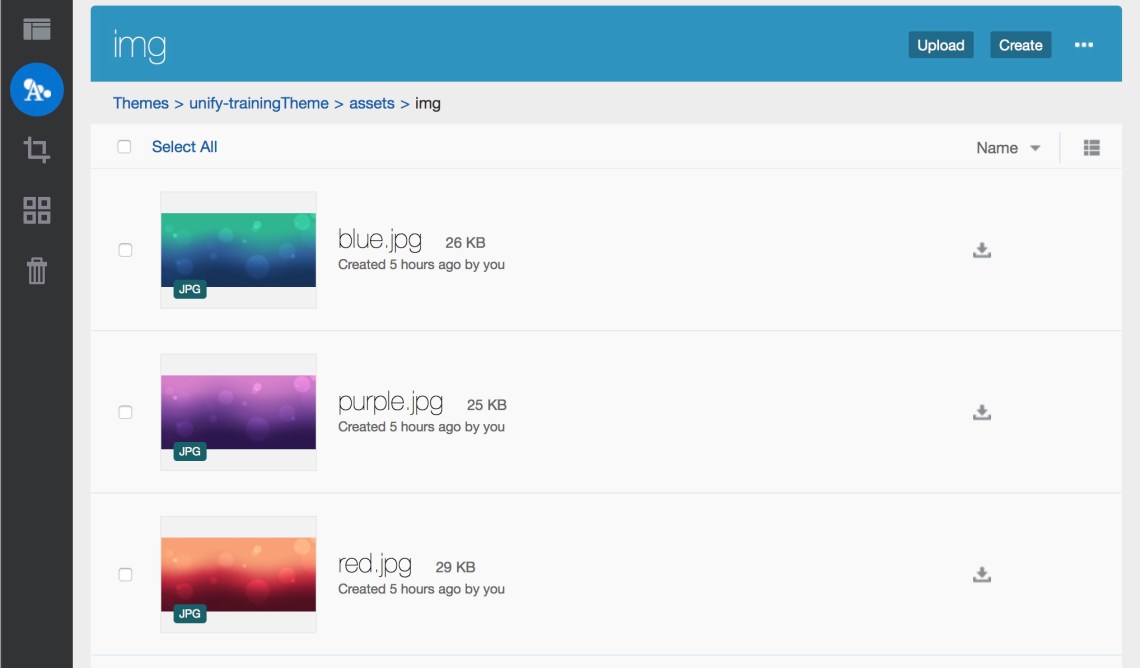
After ‘img‘ folder is created, upload blue.jpg, green.jpg and red.jpg files that you downloaded with the JSSOR slider to this folder. In the next post I will show how you can use the Asset Management in Sites SDK to enable selecting images for your JSSOR Slider component.
Create View Model for JSSOR Slider Component
To complete development of JSSOR Slider component you need to modify the ‘render.js‘ file that was auto-generated for your new component and add custom binding handler to update the slider and several minor changes to make HTML template, styles and view model working together. Open ‘render.js‘ file in the editor and replace its content with the following code:
/* globals define */
define(['knockout', 'jquery', 'text!./render-template.html', 'css!./style-template.css'], function (ko, $, jssorTemplate, css) {
 'use strict';

 // create a custom binding handler to update the slider
 ko.bindingHandlers.jssorSetupSlider = {
 update: function (element, valueAccessor, allBindings, viewModel, bindingContext) {
 var options = {
 $AutoPlay: true,
 $SlideDuration: 800,
 $ArrowNavigatorOptions: {
 $Class: $JssorArrowNavigator$,
 $ChanceToShow: 2
 },
 $BulletNavigatorOptions: {
 $Class: $JssorBulletNavigator$,
 $ChanceToShow: 2
 }
 };
 var jssor_slider1 = new $JssorSlider$(viewModel.sliderId, options);
 /*responsive code begin*/
 /*you can remove responsive code if you don't want the slider scales while window resizing*/
 function ScaleSlider() {
 var refSize = jssor_slider1.$Elmt.parentNode.clientWidth;
 if (refSize) {
 refSize = Math.min(refSize, 1920);
 jssor_slider1.$ScaleWidth(refSize);
 }
 else {
 window.setTimeout(ScaleSlider, 30);
 }
 }
 ScaleSlider();
 $(window).bind("load", ScaleSlider);
 $(window).bind("resize", ScaleSlider);
 $(window).bind("orientationchange", ScaleSlider);
 /*responsive code end*/
 }
 };

 // ----------------------------------------------
 // Define a Knockout ViewModel for your template
 // ----------------------------------------------
 var SampleComponentViewModel = function (args) {
 var self = this,
 SitesSDK = args.SitesSDK,
 themePrefix = SCSRenderAPI.getThemeUrlPrefix(),
 imagePrefix = themePrefix + '/assets/img/';

 // store the args
 self.mode = args.viewMode;
 self.id = args.id;
 self.imagePrefix = imagePrefix;

 // sett up slider ID based on the instance
 self.sliderId = 'jssor_slider_' + self.id;

 // create the observables
 self.layout = ko.observable();

 // handle initialization
 self.componentLayoutInitialized = ko.observable(false);
 self.customSettingsDataInitialized = ko.observable(false);
 self.initialized = ko.computed(function () {
 return self.componentLayoutInitialized() && self.customSettingsDataInitialized();
 }, self);

 // Handle property changes
 self.updateComponentLayout = $.proxy(function (componentLayout) {
 var layout = componentLayout ? componentLayout : 'default';
 self.layout(layout);

 self.componentLayoutInitialized(true);
 }, self);

 self.updateCustomSettingsData = $.proxy(function (customData) {
 // get any custom settings data
 self.customSettingsDataInitialized(true);
 }, self);

 self.updateSettings = function (settings) {};

 // listen for settings update
 SitesSDK.subscribe(SitesSDK.MESSAGE_TYPES.SETTINGS_UPDATED, $.proxy(self.updateSettings, self));

 // Initialize the componentLayout & customSettingsData values
 SitesSDK.getProperty('componentLayout', self.updateComponentLayout);
 SitesSDK.getProperty('customSettingsData', self.updateCustomSettingsData);
 };


 // ----------------------------------------------
 // Create a knockout based component implemention
 // ----------------------------------------------
 var SampleComponentImpl = function (args) {
 // Initialze the custom component
 this.init(args);
 };
 // initialize all the values within the component from the given argument values
 SampleComponentImpl.prototype.init = function (args) {
 this.createViewModel(args);
 this.createTemplate(args);
 this.setupCallbacks();
 };
 // create the viewModel from the initial values
 SampleComponentImpl.prototype.createViewModel = function (args) {
 // create the viewModel
 this.viewModel = new SampleComponentViewModel(args);
 };
 // create the template based on the initial values
 SampleComponentImpl.prototype.createTemplate = function (args) {
 // create a unique ID for the div to add, this will be passed to the callback
 this.contentId = args.id + '_content_' + args.mode;
 // create a hidden custom component template that can be added to the DOM
 this.template = '
<div id="' + this.contentId + '">' + jssorTemplate + '</div>
';
 };
 //
 // SDK Callbacks
 // setup the callbacks expected by the SDK API
 //
 SampleComponentImpl.prototype.setupCallbacks = function () {
 //
 // callback - render: add the component into the page
 //
 this.render = $.proxy(function (container) {
 var $container = $(container);
 // add the custom component template to the DOM
 $container.append(this.template);
 // apply the bindings
 ko.applyBindings(this.viewModel, $('#' + this.contentId)[0]);
 }, this);
 //
 // callback - update: handle property change event
 //
 this.update = $.proxy(function (args) {
 var self = this;
 // deal with each property changed
 $.each(args.properties, function (index, property) {
 if (property) {
 if (property.name === 'customSettingsData') {
 self.viewModel.updateComponentData(property.value);
 } else if (property.name === 'componentLayout') {
 self.viewModel.updateLayout(property.value);
 }
 }
 });
 }, this);
 //
 // callback - dispose: cleanup after component when it is removed from the page
 //
 this.dispose = $.proxy(function () {
 // nothing required for this sample since knockout disposal will automatically clean up the node
 }, this);
 };
 // ----------------------------------------------
 // Create the factory object for your component
 // ----------------------------------------------
 var sampleComponentFactory = {
 createComponent: function (args, callback) {
 // return a new instance of the component
 return callback(new SampleComponentImpl(args));
 }
 };
 return sampleComponentFactory;
});</pre>
<pre>
Note the following changes that I made for JSSOR Slider component:
- The define statement has been extended to include references to HTML template and CSS style files.
- The ‘jsssorSetupSlider‘ method define ‘update‘ handler function that includes code to initialize the JSSOR slider. Apart from using dynamically generated ID for the element that contains slider HTML, the code is identical to that in the ‘with-jquery.html‘ file.
- View Model is updated to include code to initialize ‘imagePrefix‘, generate ‘sliderId‘ and add ‘jssorTemplate‘ to the component HTML.
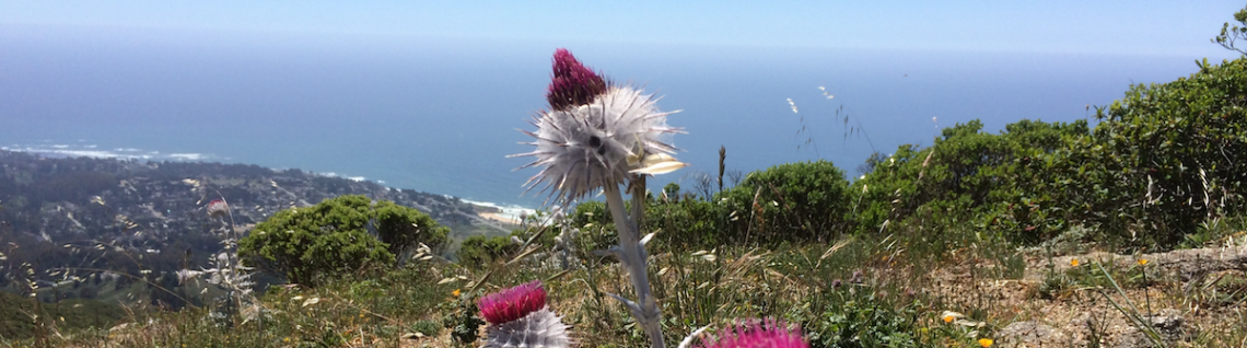
Add new JSSORT Slider component to a site page. You should see it rendering slider with three images that you uploaded to the site theme:

Train is arriving to London Kings Cross.. time to hit Publish and close the lead of my laptop.
 Igor's Musings About Technology
1 Comment